YouTube Thumbnail: How to Create a Clickable Thumbnail in 2021
Hi YouTube enthusiasts!
Leveraging a great, high-contrast, attention-grabbing picture of the right size that accurately portrays what your video content is about are the real features of captivating Youtube thumbnail. Thumbnailshould comprise meaningful visuals, uniquely define your brand value, should be presentable, interpretable within a glance, can have close-up faces to show emotionsare some of the best practices that answers the billion-dollar question i.e.,how to make a clickable thumbnail.
According to YouTube Creator Academy, 90% of top-performing videos use a custom thumbnail. They act like book covers/posters to help the viewer decide to watchyour video or not.
So, if the thumbnailimagesare well crafted, they cansurely increase your click-through rate, encourage viewers to watch your videos because they know what to expect, and make your content tempting for anextensive range of advertisers/brands.
These golden signals make the algorithm lift your visibility and recommend your videos more frequently to more target audiences.
Your video’s click-through rate is one of the most crucial ranking factors besides watch time that decide youtubers gain viewership. Video engagement is the powerful metric in the eyes of the platform’s algorithm and the first hour of its release on the platform is crucial, an eye-catching thumbnail can make a massivetransformation in overcoming this important aspect and decide the fate of the video to be in the visible / recommended areas or get deep buried into ocean.
Hence, your visual aesthetic is the determining factor of your long-term success, therefore to overcome all your thumbnail problems, following are the solutions! But before details, let us get deep dive into what the thumbnail is and what it is not!
What Is a YouTube Thumbnail?
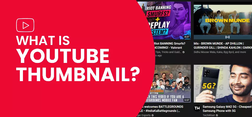
Thumbnails are the small sized versions of still images/graphics or visual icons that represent the content of a YouTube video. They are used forevery YouTube video and are considered a chief factor in a video’s click-through-rate, ranking, watch-time and views.
Video content is ruling the internet. By 2022, videos will constitute 82% of the global internet traffic, Cisco envisages.
An attractive custom image selected as a video thumbnail, works like a magnet to attract the target audience and distinguish it from the vast videos uploaded on Youtube everyminute-500 hours! (Statista)
As they are the introductory element of a content, many creators fail to do full justice to this component of the video.
Relax, in this blog, you will find all the best strategies to implement to reach the target goal of a click worthy one!
Videos are very effective, and that is why 81% of brands leverage video marketing(Influencer marketing hub). According to Statista 2021, World’s second-most popular website, YouTube, is visited by 2.3 billion people monthly.
Also read: How to create a YouTube video that attracts audience
The competition on this platform is fierce, with 500 hours of video content uploaded every minute! For your videos to stand out and sparkle in this ocean & crowded arena of video content, you need to know, how to make a clickable thumbnail which is striking & eye-catching for them.
Video thumbnails let viewers see a rapid snapshot of your video. YouTube Academy calls video thumbnails “billboards to help viewers decide to watch your videos”. Incredibly increasing video’s click-through rate, a compelling & click-worthy image plays a crucial role in ranking your videos higher with the algorithm which further helps you to grow your channel, drive your target audience, increase number of subscribers and generate a good source of income. People are now so curious to grow their channel that they buy YouTube subscriberscheap, who are real and legit users.
Now let us understand deeply, how to make thumbnails for YouTube.
How to create a custom video thumbnail?
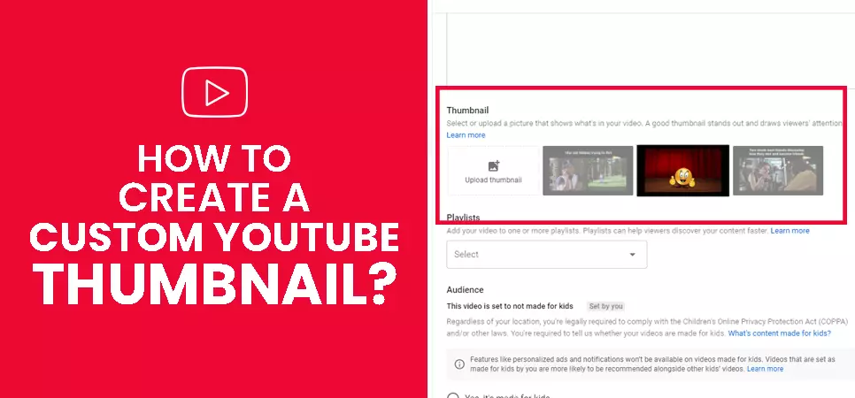
Locating a featured/custom image is a reallycalmprogression that just requires a few clicks.
Step 1-Verify your account- To upload custom thumbnails, you must have a verified account.
Step 2-Confirm, you are not a robot- Verifying your phone number lets your entree supplementary features on YouTube, and helps it make certain that you're a passionate creator, not a robot.
Step 3-Submit your verification code- You need to enter the verification code which will come on the mobile number you provided.
Step 4- Select your country- choose the country name in which you live.
Step 5- Bravo! You are now eligible to create a custom thumbnail. Represent your creativity & innovation now!
Step 6- Upload your video- After your video is finished uploading on YouTube, you can select a thumbnail from the three options the platform automatically engenders. Yes, it automatically yanks from your video images, but this mechanism limits the video’s potential as these images are sometimes blurry, out of focus and irrelevant to the target goal. Hence, you must upload your own, customized one.
Step 7- Head to ‘custom thumbnail option’- In the right of the thumbnails, you’ll see a tab that says “Custom Thumbnail.” Just click it to formulate a thumbnail of your choice from your desktop!
Step 8- Upload your customized image- After successfully uploading a custom image, you’ll see it appear where the ‘custom thumbnail’tab appeared.
Step 9- Preview your customized image-You can preview it at the top left and change a video’s highlighted image whenever you want, even after the video has been published. Voila! You just crossed a milestone between your YouTube success!
Step 10- Swipe the image if not driving clicks- Just click on this image if you want to switch it out with another or your click through rate is low. But if your CTR is above average, we highly recommend not to change your recognition & identification symbol.
What are the best YouTube thumbnail sizes?
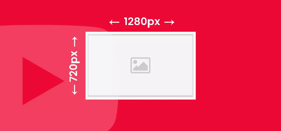
Google recommends, your image should be 1280 x 720 pixels, with a minimum width of 640 pixels. And a ratio of 16:9 is perfect. While the thumbnail will be minor when popping up in searches, it will be expanded to a full video’s size when it shows up as a suggestion for the next watch. To know, how to make eye catching thumbnails you must use larger image sizes that can be scaled down, instead of a small size that will be ascended.
Important technical minutiae include:
-
It must be in .JPG, .PNG, or .GIF image formats
-
The image file must be under the 2MB file size limit
You can use free online Youtube thumbnail makers; For example, Canva, Adobe Spark, Fotor, Snappa, Visme, Bannersnack, etc. to formulate professional and compelling thumbnails.
Also read: How to start a successful YouTube channel in 2021What Should My Thumbnail Image Be?
A well formulated thumbnail encapsulates all the awesomeness of the content and attracts the audience in the first few seconds and encourages them to click on the video, view and help it to gain more subscribers. Hence, you must choose an image that is compelling, captivating and alluring to gain clicks exponentially.
Strategies to create click-worthy thumbnails
Strategy#1 Select an appealing image that works
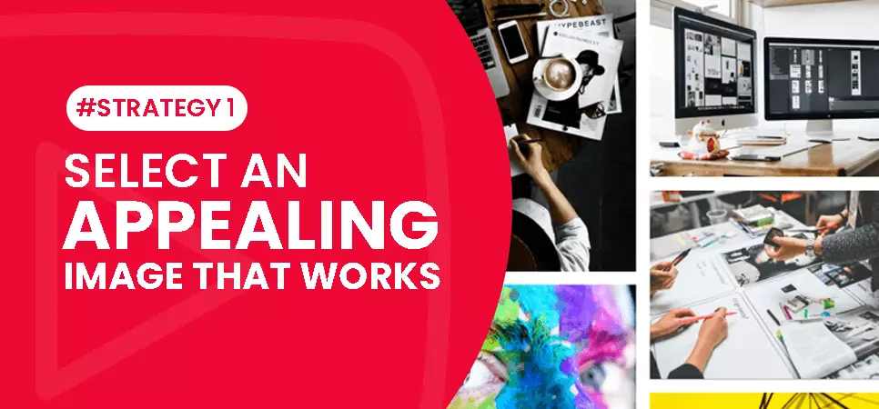
Always use an image that accurately represents the content, specifically the content in the starting of the video. Otherwise, viewers will feel cheated, which will erode the trust of the viewer and damage the channel’s reachability & viewership in the long run. You can also leverage photo editing tools to make alterations to get some spectacular images. To formulate a relevant design/image which compels the viewer to click-through to the video for your thumbnail you can use-
-
Brand logo, differentiating your brand(branding) to increase recognition & awareness
-
Represent emotion in motion!
-
An amusing facial expression
-
Screenshots/snapshots from your video
-
Action shots to capture viewer’s attention conveying the subject of the video content
-
Still images- It is a brief snapshot of your videos content
-
Meaningful animations / graphics
-
Product image to advertise/showcase
-
Brand name
-
High quality picture that acts as a teaser and grabs the audience attention.
Strategy # 2 Include simpleyet commandingtext
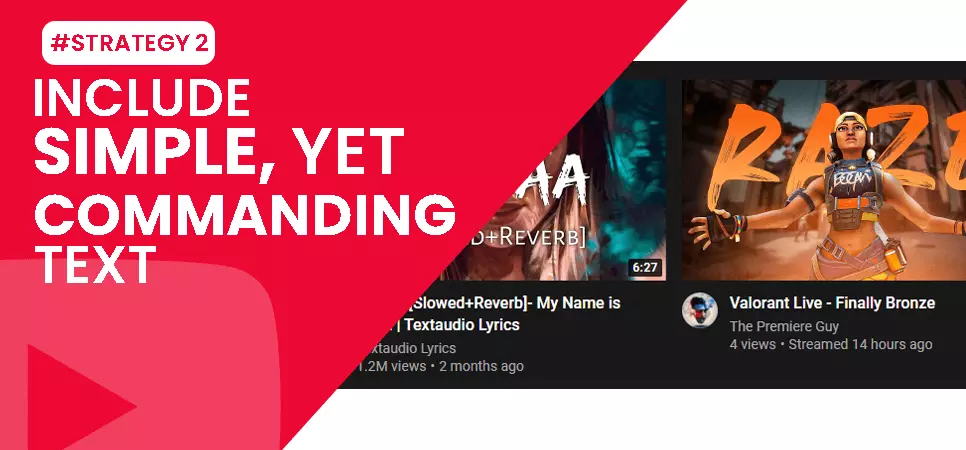
Thumbnails appear really small particularly on mobile phones, which gives you a very little space to add text. To get the most use of text, you need to make the confrontations simple yet striking. Remember,one picture is equivalent to a thousand words, but six words inside a photograph is worth a million views!
Therefore, write something that inspires the target audience to click. As a rule of thumb, write your thumbnail text to about 4 to 5 words maximum.
Text raises the probabilities to grabsuser-attention, spark emotions and drive traffic to your video. To grab the target audience’s attention and engagement, use bold, highlighted text withstylish fonts.
Strategy # 3 Include an amusing facial expression to build an emotional relationship
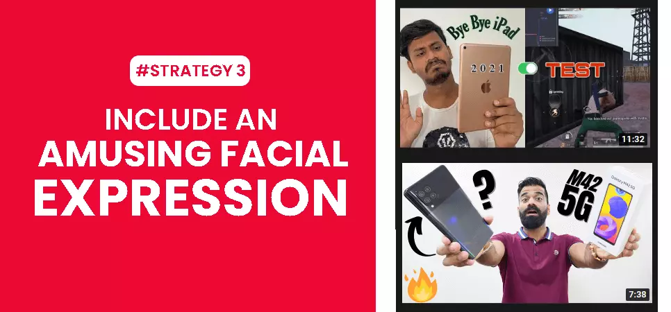
A thumbnail performslike a visual call-to-action for provoking the target audience. Complementing quality content with a visually-appealing, well-articulated custom image evolves as awinning elementtaking benefit of this psychological attribute. When viewers feel more connected, they're more likely to click your video. Hence, draw traffic by featuring big, close-up faces in your custom image. If you are still wondering, how to make an eye-catching thumbnail,address your curiosity, flourish relevancy, blossom with emotions and consider how you’ll humanize a visual story.
Strategy # 4 Leverage BOGY thumbnails to be visually appealing

You can impress your viewers at the very first glance with the right colour palette. You can enhance your image with some editing tools like Fotojet, Snappa, Canva etc.When creating custom CTR increasing images for your video, turn up the brightness, increase the contrast and ensure something stands out as a pivotal point. This gives a snowball effect to catch visual attention quickly and work much better than shadowy blurs.
Make the best use of colors (You don’t need to be too gaudy and bright)
Take the colour of YouTube interface into consideration, so you'd better make a bright background and contrasting for your video that will be catchy against white colour background. And dark colors might not represent well in the list.
Just select the complementary colors or opposite colors. The complementary pairs are red–cyan, green–magenta, and blue–yellow. When seen together, they will create the sturdiest contrast against each other, which will make your proposal easier to be perceived.
Using contrasting colours as your background like; orange, purple, pink, blue, light green can hold a strong contrast too.
Pro tips-
Add sticker effect to your thumbnails to make them look more eye catchy
-
To establish identification and recognition, you can create a thumbnail template for your YouTube channel and attach a similar thumbnail to each video.
-
If your text is brighter, then use a dark background.
Strategy # 5 Choose a click-worthy image and not a clickbait
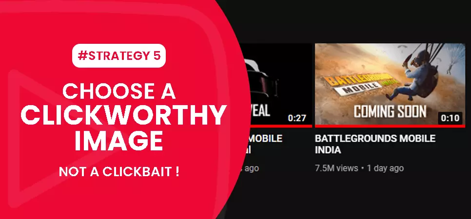
Click-worthy is when your design drives traffic for relevancy purposes i.e., your thumbnailsare a signal of what’s included in your video or at least provides a sense of direction, they are catalysts of emotion and users are drawn to clicking because they want to learn more.On the other hand, clickbait images can ruin your channel reputation. Hence, always put your accurate image to play at the front foot.
Also read: How to find your YouTube Channel Niche in 2021
Strategy # 6 Brand your designs with a logo
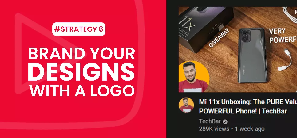
A Brand logo can differentiate your brand from other competitors in your niche and bring some uniformity to your videos. You don’t need to give your logo much of the space on the image.When capturing your video whether it’s a product demonstration, tutorial, skill-show, thought leadership interview or a customer testimonial, remember to capture some focused still images that can be used as your design.
Strategy # 7Avoid lower rights
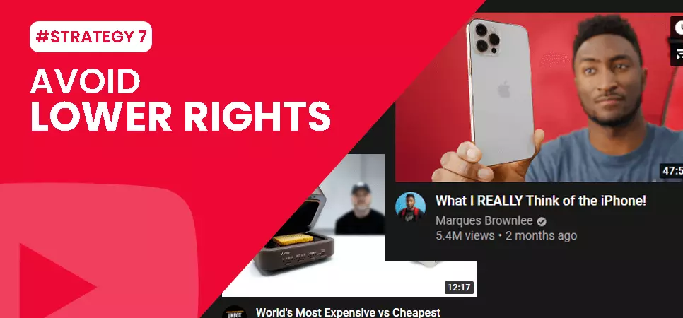
Nothing in the thumbnail should obstruct the track of the viewer’s view. Be cautious not to place anything significant on the lower right, because that’s where you find time imprints and evidence about the video.
Strategy # 8Keep testing

Use the A/B test tool to make a test. You will know which thumbnail image is more likely clicked by your viewers. And you can comprehend whether the design is working for you or not. You must replace it or not. Split test different designs of your thumbnails and check which one is gathering you more organic views and have higher click-through rates. You can use Tube Buddy’s video A/B feature to see which thumbnail works best to raise clicks from your target audience.
Strategy # 9 Use YouTube thumbnail makers
You can use Photoshop to know, how to make professional thumbnailtemplates, or you can use other free online services like Canva, Snappa, adobe spark, PicMonkey and Fotojet. After visiting a free online tool;
Step 1- Select a relevant image for your thumbnail
Let the audience know what to expect from your content. You can also utilize a special spin feature to attract your target audience, by using a 360degree rotating product image, which rotates representing more pictures of the product.
Step 2- Add context, graphics, clippings and a give a suitable background to your design
Spice up the background using patterns, which goes well with your content’s subject/theme. You can add a short, beautiful, bold text here titling your video, which a viewer can read easily. Always remove the distracting/irrelevant background from your thumbnail image
Step 3- Give your thumbnail outline and sticker effects
To drive your target audience, use sticker models and animations in your thumbnail. You can highlight your subject using different colours, and even tilt your image to 45 degrees to make it look more presentable. Outlining a subject/text also make it look more appealing and read worthy.
Step 4-Finally download and preview your thumbnail image
Download the final thumbnail and preview it for any shortcomings, and then upload your videos with it to see the magic in terms of more organic growth of your channel, more subscribers, likes, comments, incredible raised viewership, and boost in the search results. You can formulate, save, reuse, tailor, and resize the specific graphics to create a compelling thumbnail that attracts more people to your channel, and make all your videos instantly recognizable too.
Use these 8 strategies to know, what thumbnails get the most clicksand sparkle your YouTube videos to reach the target goal of -success.
Users on YouTube watch over 1 billion hours of video each day. What do you think makes them click on the video? Of course, the thumbnail. If you create a visually appealing thumbnail with words that stimulate the interest of the viewers, then I can guarantee you that you will see a rise in the views of your content.
Many YouTubers buy subscribers from real people to get more views and engagement, but the thing is, they won’t see results if the thumbnail is not authentic and attractive enough for the purchased subscribers to click on their video. The subscribers delivered through genuine websites are real people living in this world. So, to keep them, you need to provide them with real value.
Make sure your thumbnail doesn’t seem like a scam. Be honest with what your content is going to be. There are YouTubers who witness a high click-through rate but do not receive enough engagement and decide to buy YouTube likes rather than seeing if their thumbnail aligns with the video they have created. Even before the description, the thumbnail gives a definition of a particular video. I know how the saying goes, “Do not judge a book by its cover” but, in today’s world with people having less time in their hands, they don’t have another option but to judge a video by its thumbnail.
Feel free to share!